KENMORE

Visit to Kenmore and Site Analysis

We made the trip to Kenmore by bus early on the Friday morning and enjoyed a picturesque drive through Perthshire and past Aberfeldy to arrive in Kenmore. The scenic landscape was true to the beauty of the Scottish highlands with steep sloping hills and a miriad of colourful trees increasing in density the further we went from Dundee. This set the scene for our site. The entire village is remote enough and so rich in nature to entice anyone who is passionate to the landscape to want to live there.

Before visiting the site we went to the crannog centre which was an interesting experience. This reminded me of projects I did in primary school studying Brochs and Crannogs and the type of people living there.


Inside the crannog was an interesting strucural design with the roof pattern thoroughly, thought out design
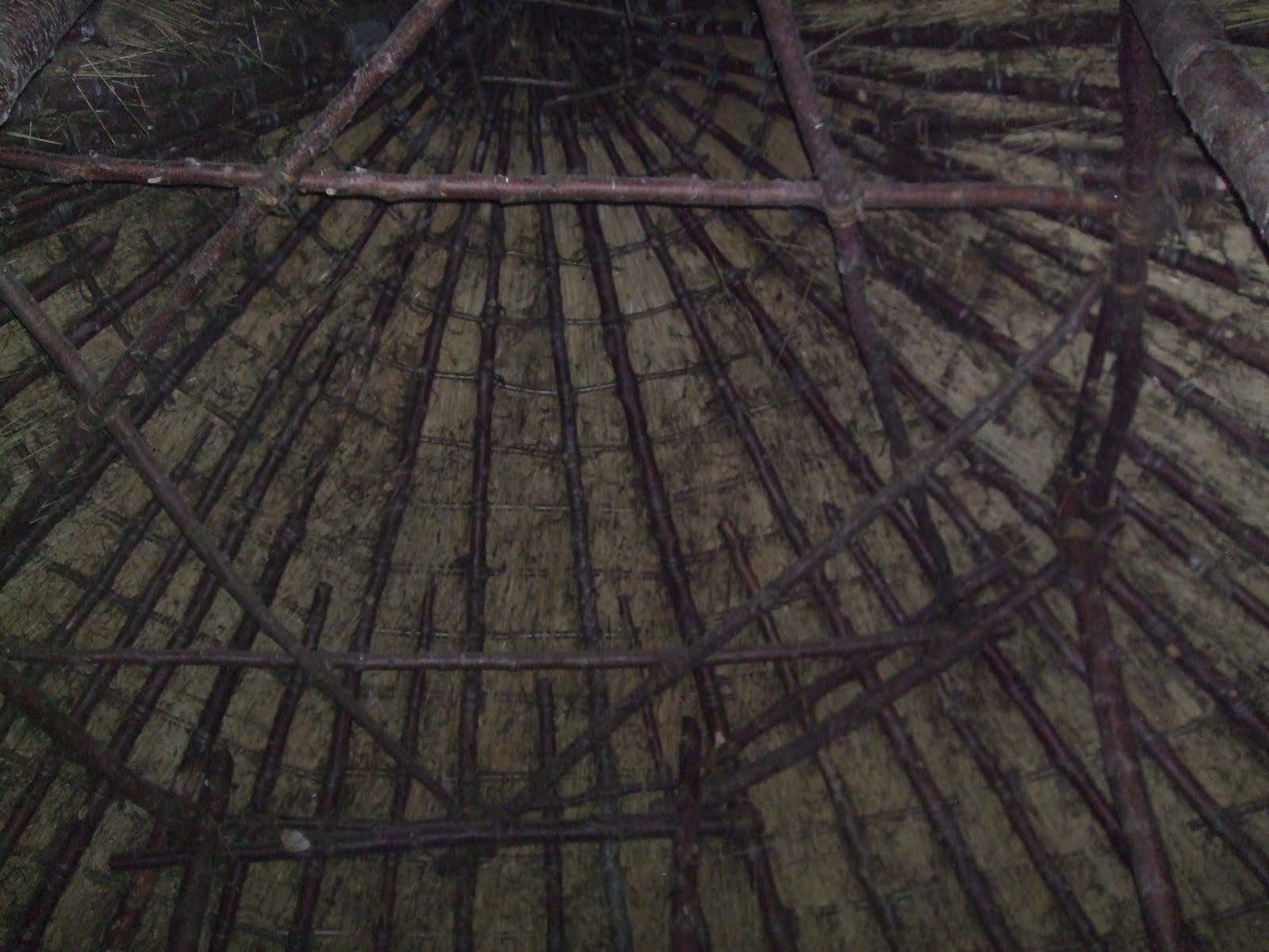


I was particularly interested in how the crannogs, although renovated, had managed to achieve such longevity. The reasons for building out on the water also helped me think about my design and the advantages of building on the water. The stone age civilisation used the house on the water for defense, protecting their food and livestock and for status: to show other tribes their power and skill in builing a house on the water.

This was the approach from the main road we walked along from the Crannog Centre. We walked along the main road and one of the first things you see of the village is the site jutting out on to the water giving the impression that its floating. To me this means that the building should be designed in a vernacular style as it is one of the first buildings people see on entering the village and so it should be in fitting with the style and history of the location.


Although this is the main approach i preffered the alternative approach coming from the east side towards the site. Here it is more private and colourful especially in the autumn, it is also quieter way to enter the building.


Our Approach to the Project


FIRST FLOOR


GROUND FLOOR


BASEMENT


The first part of the project was to draw plans of each floor at 1:100


The next step was to build a volumetric model at 1:100, replicating the house and demonstrating the different types of spaces. We made this by measuring the dimensions of each space and cutting it out in cardboard, then wrapping each room in the appropriate colour with tissue paper.


Red = Public External Space


Blue = Public Internal Space


Green = Circulation


Yellow = Private Internal Space


Orange = Private External Space


This model was followed by a circulation model, to show the main routes taken throughout the house. The overall result wasn't as successful as the idea we had in our head and we decided in future it would be more effective to build the model with perspex on the outside of the cardboard pathways.


Hard at work drawing up a site section and western elevation of our house at 1:50 scale.


Building the circulation model caused us to think about how the building stands and where the load-bearing walls were located. We understood this to be a fundamental part of the building as the focus is on structure to allow for the cantilevering floors.


Hence we built a 1:50 structural model through a section of the house to emphasise load-bearing walls.


Our final model was an analytical one which greatly heightened our understanding of the buiding in terms of space and scale. We built this at 1:100 and built a contour model at the same scale to fit witht this. The overall effect characterises the building quite well.


CASA PONCE

Site Plan - Buenos Aires, Argentina


Main entrance over a bridge to get to building. Klotz focuses on a guided circultaion in fitting with the length of the house.

The journey through the house is completely thought out by the architect with the entrance inviting people to the house with a dramtic concrete arch.


Open floor space, showing ribbon windows and views of river. Klotz intended to make the windows low enough to give the water the appearance of cantilevering from the building.

This is in fitting with the style of the building balancing on edge, giving it a delicacy.
This section shows how the weight is focused throughout the house and shows the importance structure has in this design. The purpose of cantilevering the building is to create a sense of weightlessness. It hardly touches the earth and fits in easily with the site's topography. When experiencing the space you feel as if you are hardly in a building because the windows incorporate so much of the environment and the floors seem unsupported by the land.

Precedent Analysis - Mathias Klotz


Mathias Klotz is one Chile's most accomplished architects, recently being awarded the Borromini Prize in 2001. His work is heavily based upon Modernist Tradition with similar characteristics reccuring in many of his projects.

Our group was given the task of analysing Casa Ponce House in Bueno Aires, Argentina.


Klotz claims that his buildings are not influenced by an previous works of architecture. He is a firm believer that architecture should be experienced first hand and that showing buildings through photography or sketches is an inaffective method of communicating the beauty of space. This ultimately has a huge impact on his work, as can be seen with Casa Ponce whereby the building is not overly decorative or ornate but has a delicate quality and plays with open spaces and breaking down the barriers between internal and external space.


Although Klotz says he takes little reference from previous architects work, similarities can be drawn between Casa Ponce and Le Corbusier's Villa Savoye.


Casa Ponce is entirely based upon Modernist tradions developed by Le Corbusier with his Five Points of Architecture.


FIVE POINTS OF ARCHITECTURE


1) Pilotis - reinforced concrete steel stilts upon which the building stands. Their purpose is to lift the building off the ground giving it a sense of weightlessness and freedom from the ground. Klotz himself said that when you raise the building from the ground and try to free it from gravity, you are nearer to achieving a purity in space.


2)Open Plan - Free from load-bearing walls, meaning that the architect is free to design rooms without concern for the structure.


3) Free Facade - Follows on from the open plan; allows architect to build rooms without worrying about load-bearing walls


4)Roof Terrace - to breakdown the barriers between external space and internal space by bringing the outside environment in. The roof Terrace also makes up for the space created by the building ie. instead of having a garden area, this outdoor space is within the area made by the building and takes up less of the surrounding environment.


5) Ribbon Windows - Allows light to filter in through the house, again breaking down the barriers between outside and in.


Each of these points is demonstrated on Le Corbusier's Villa Savoye.


Casa Ponce fits in with each of these points, making use of pilotis, open floor plan, free facade, roof terrace and ribbon windows.


Previous works by Klotz have the same properties.


CASA REUTTER COLLEGE


ARKINETIA


Mapping Entrance


3 PERTH ROAD


The first challenge of this project was working out how to work effectively as a team. We decided to split the door into sections and designate a piece to each group. My group was working on the pillars and so after taking photographs and making quick sketches we took measurements of everything and linked this to our drawings.


For detail of the spiral at the top of the pillar we made rubbings and printed life-size photos to trace.


As a group we began drawing the doorway on Monday starting at the top of the entrance and working downwards. Some members of the group worked on drawing whilst others called out measurements and we rotated for lunch breaks. One team member also worked on a drawing with every measurement on it for reference and our portfolios.


The final part was deciding on how to render the drawing. We decided that we should keep a recurring theme - whilst using various media we should stick with dark black and white colour and some blue midtones. One picture was e-mailed to the group and used as a reference for drawing and showing where the light came from.


One team member worked in the workshop making a bracket to hang the sheet from the balcony.


THE FINAL PRODUCT


I reckon everyone was pleased with how it turned out!

My Journey Around Dundee - Inspiring Place

This project gave me the opportunity to wander aimlessly around Dundee for the first time -finding my bearings, making first impressions and waiting for inspiration to strike.


I had a general idea about trying to find an enclosed space that had a different atmosphere compared to the surrounding area and how surroundings actually affect a space rather than admiring a building. The first place I found was in the park...


But it wasn't really knocking me off my feet. That area is interesting though, to look out across the city from such a height even if you're uncertain about how to get home.


I made my way from here, to the textiles part of the city with run-down old factories, loaded with history and character; though eerily desolate. I could quite happily have taken several photos and used these for my final project but my camera was playing up and one other place I had visited earlier in the day was playing on my mind. I did manage to get a few snaps though.


I'm not entirely sure why, but there seems to be a recurring theme of alley ways or tight pathways throughout this project as my final place of choosing was at Seagate Bus Station.


This had much more of the visual impact that I was searching for. It's very easily missed from the pavement which is on a main road and full of people throughout the day. On entering the alley the atmosphere completely changes: it's darker and the acoustics differ so that you feel completely detached from the main streets at either side. I'm still unsure as to whether I felt uneasy and isolated or comforted by the reprieve from the animations of the city.


I liked this shot for showing the varying textures found within the alley and how our vision becomes warped showing the buildings around to be more curved from this perspective than they actually are. Also, we can't see an end to the path - deep and meaningful? pretentious? Dunno...either way I found it interesting.


This one is the same...textured, run down, with an interesting open space in the middle...


I did chance a sneaky shot of this stranger who passed by - the only person that I saw the entire 20 minutes I spent there taking photographs. It was good to show the scale, give an idea of height and show isolation.


I of course had to venture out at night, not without some friends for protection. I found the place even more peaceful at night and took some comfort in the sparkle of the lithium lights. My friends, however, were scared of being attacked showing how the space affects people in different ways.